One NYT Critic May Owe Prada.com An Apology
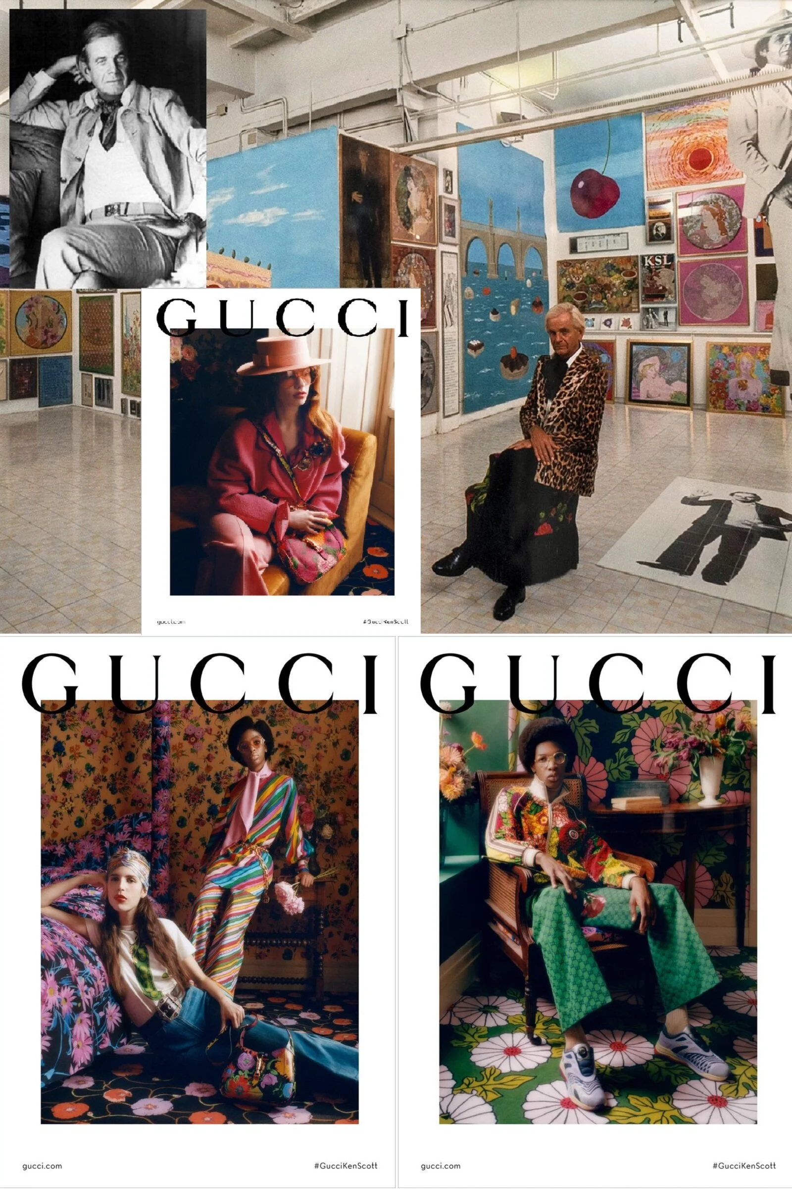
/ Burberry’s artofthetrench.comhttp://bit.ly/7ar9xj
The Argument
There’s nothing worse than the pot calling the kettle black, which is the irony of today’s NY Times Critic’s Notebook Why So Stodgy, Prada.com?
Opinion #1: SEO purpose headlines
I agree that on first impression Prada.com’s not nearly as captivating as Burberry’s new ArtoftheTrench. But it’s better than ‘stodgy’, a fact I disputed immediately reading the NYT headline. In reality, the critique doesn’t even discuss Prada.com, and I assume the brand name is used for headline SEO ranking purposes.
Burberry’s ArtoftheTrench is totally fabulous. No wonder it has 3.7 million page views and an Alexa.com of 123,000. Heading over to Alexa.com, the good news on Art of the Trench might be ebbing, but let’s table that topic for a moment.
Opinion #2: No links to key points
The Prada.com kick-in-the-butt isn’t deserved, if you actually visit the website Prada.com.
Could we please have live links NYT? All of your links except Art of the Trench go to internal NYT pages. Readers expect to travel to your reference points in today’s digital world, so links please.
Yes, I know readers might not come back, once you let them fly solo. Digital readers aren’t monogamous and every day we must prove ourselves as a worthy partners, or readers will leave us with slim chances of a reconciliation.
Opinion #3: Promoting a single web strategy
Without suggesting that Prada.com is a leader in superb fashion website development, I am saying that the Critic gives Miuccia an undeserved slap on the ass, while trying to sell page views using her Prada name.
It’s not only men who are devious in business.
The difference between Burberry’s ArtoftheTrench.com and Prada.com, is that one must dig deeper into the Italian mistress’s messages. How many times must we read that women — especially Italian and French ones — are more mysterious, more journey-driven?
This story is the tale of two qualitatively different websites. One is wonderfully transparent and in your face. The other is a slow-cooker and more intellectual. One site made me smile. The other truly inspired me during my visit.
Opinion #4 Not being familiar with headline topic, in this case Prada.com
Miuccia Prada has always expected her public to think deeper, as part of her brand DNA. Prada is an intellectual who rarely sells herself naked in public. Expect her to be more sublime than a bullet point in our mostly superficial fashion world.
I predict that the trend towards a new global intellectualism is real. Prada knows that and she’s just fine sticking to her brand DNA.
Given the chaos going on out there, I’m frankly pleased that someone thinks deeply. Perhaps we should make Miuccia Prada Secretary of Homeland Security.
Prada.com a flash website, making linking to individual pages impossible. Major categories on the website are linkable. After that, you’re on your own to find what I’m talking about. This is my pet peeve with Flash, but I digress.
Prada.com presents us the Transformer Project with plenty of Rem Koolhaas informational video, which is also on YouTube. This migrating, shape-shifting Transformer exhibition space will visit ports of call around the world, temporarily housing Prada-sponsored events.
Back to Fashion at Prada.com
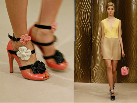
 Fall 2009 Fashion EditorialThis moment we see Advertising editorial from Fall 2009 and Spring 2010 resort runway. Is this boring and irrelevant? Not to fashionistas and Smart Sensuality women.
If so, the entire industry’s in the worst possible trouble.
Next Prada.com promotes the Fondazione Prada, another intellectual think tank from our Italian mistress. We’re greeted with fireworks and a Happy New Year message on the landing page. Personally, I prefer sparklers.
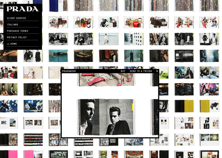
Onto Prada’s new book and a presentation hardly from the Dark Ages.
True, readers didn’t supply the content, but it may be awhile before Prada turns over her design identity to her followers. As Andy Rooney would say (and I barely tolerate him most days, but he does come to mind) “you can hardly blame her.”
 The new Prada book is currently oversold on Amazon, but more are coming in early Feb. For an $80 (discounted) book to have a 16,000 Amazon US rank is testimony to Prada’s reach.
The Ratings
Let’s check into Alexa.com, the Amazon-owned website surveying engine used by over 35 million Internet users, and other research inputs. Originally Alexa.com was too male-minded in users.
Alexa.com Report Card: Artof theTrench.com and Prada.com
I’m a stickler on grade inflation, before we condemn Prada.com against the new kid in town.
Let’s take a look at the Alexa.com’s analysis of these two websites. To create added perspective, I’ve included Anne of Carversville and the NYTimes to the analysis.
Alexa Rank Last 90 Days:
ArtoftheTrench.com 122,741 (great for a new website, although it’s falling off fast in Dec.)
Prada.com 46,481
AnneofCarversville.com 156,635
NYTimes.com 97
Page Views Per User 90 Days
ArtoftheTrench.com 1.23
Prada.com 1.6
AnneofCarversville.com 30
NYTimes.com 3.25
Bounce Rate Month (left after first page)
ArtoftheTrench.com 48%
Prada.com 44%
AnneofCarversville.com 26%
NYTimes.com 55%
Time on Site 90 Days (now in seconds)
ArtoftheTrench.com 195
Prada.com 143
AnneofCarversville.com 4369
NYTimes.com 283
The Finish
My point is this: ArtoftheTrench.com is a great concept but not necessarily a long-term one for the Burberry brand. Traffic is falling fast and the challenge is to create content so that users return. This month’s falloff is steep.
The knee-jerk reaction is to assume that this is the great new thing and we should all get in line. This is Madame Critic’s asssertion. I’m not making the case that Prada.com is a great website. But she can hold her head high against ArtoftheTrench.com, based on the data. I daresay that she will technically win the Internet stat game.
A Different Expression of Customer Relationship
I’ve saved the best Prada experience for our sendoff.
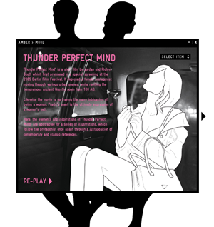 Without criticizing trenchcoats in any way, I will remember my Prada website experience much longer, because of this video. You can find it in the Amber Mood section, but I’ve pulled it off YouTube for our easy viewing
I LOVE this Prada film. I could not have done better myself, so perhaps it’s OK that she oversaw the design and development of “Thunder perfect mind” and didn’t make it a hive project.
Could Prada build off the concept, with her followers contributing? Of course. Sometimes, though, it’s refreshing to learn from others. If followers is the focus, we need a few teachers.
In her film, Prada delivers to women, as she always has done. With females of every age expressing such dissatisfaction with our lives and selves, thanks to an industry devoted to telling us about our failings, it’s great to hear such a positive affirmation of modern womanhood from a woman who actually believes her speech.
If this film is stodgy and old-fashioned, I’ll take it.
Madame NYT Critic, are you certain that you visited Prada.com before slamming her? A dunderhead you are not, so I’m thinking perhaps you believed your intern who isn’t into deep thinking and has a predisposition for “I’m the Brand”, user-generated websites?
The “I’m the Brand” trend is expressed in multiple ways. I argue that the Prada film builds longer-term brand loyalty and identification. I say so, not dismissing the creative excellence of I’m the Trenchcoat, which I view as more of a promotional vehicle, than a primary branding message.
Prada “Thunder perfect mind”
After watching the film, the question is: how do we feel about corsets under trench coats? Love, you always Miuccia. You look like a Plain Jane on occasion, but you are definitely not stodgy. In fact, you are a sex pistol — in the most rarified, woman-friendly way. Anne
Wait. Wait. I’m not finished.
Opinion #5 Comments Not Allowed
What’s up with an article on web-savvy trends, that throws a headline tomato at one of the most prominent people in fashion, calling her website ‘stodgy’ and then doesn’t allow comments or opinions from readers?
Miuccia Prada’s ivory tower works well for her. The NYTimes Style Section should perhaps not be giving advice on this subject.
No comments might be considered an amazing act of ivory-tower living from we little people who are reading Why So Stodgy, Prada.com with a smile on our faces.
Never mind, NYTimes. The media world is tough out there, and I know you have a lot on your mind. Not to fear, you’re still a great newspaper. XOXO

